Product & Brand System
Company
Date
Role
Website
The Challenge
Grapple Ghoul wasn’t just a visual brand exercise, it required designing a product, brand system, and operational workflow simultaneously, without existing structures in place.
Key challenges included:
- Translating design intent into production reality
Bridging the gap between digital mockups and manufacturer capabilities required precise technical communication and clear specification definition. - Designing under multi-layer constraints
Balancing aesthetics, performance, cost, and manufacturability meant every design decision had system-level implications. - Building process while building product
Without pre-existing workflows, repeatable systems for feedback, revisions, and asset management had to be designed alongside the product. - Avoiding perfection paralysis in a launch environment
Shifting from ideal design to shippable product required clear prioritisation frameworks and decision criteria. - Cross-functional collaboration without defined roles
Working with a business partner meant aligning creative, strategic, and operational priorities in parallel.
My Approach
Grounded the project in user insight
I conducted a survey and facilitated a group discussion with members of the BJJ community to understand purchase behaviour, sizing habits, and frustrations with existing rash guard brands.
Key insights:
- Overseas brands create cost and sizing risk due to shipping and unclear fit standards
- Many Asian and female athletes struggle with proportion fit, particularly torso length, sleeve ratios, and compression zones
- Aesthetic fatigue was common, with users seeking more minimal, non-performative design alternatives
Structured the problem into three design focus areas
Rather than approaching this as a purely visual brand exercise, I defined clear product pillars:
- Fit System — accommodate petite and Asian body proportions
- Visual System — restrained, minimal graphic language
- Purchase Confidence — reduce uncertainty around sizing and quality
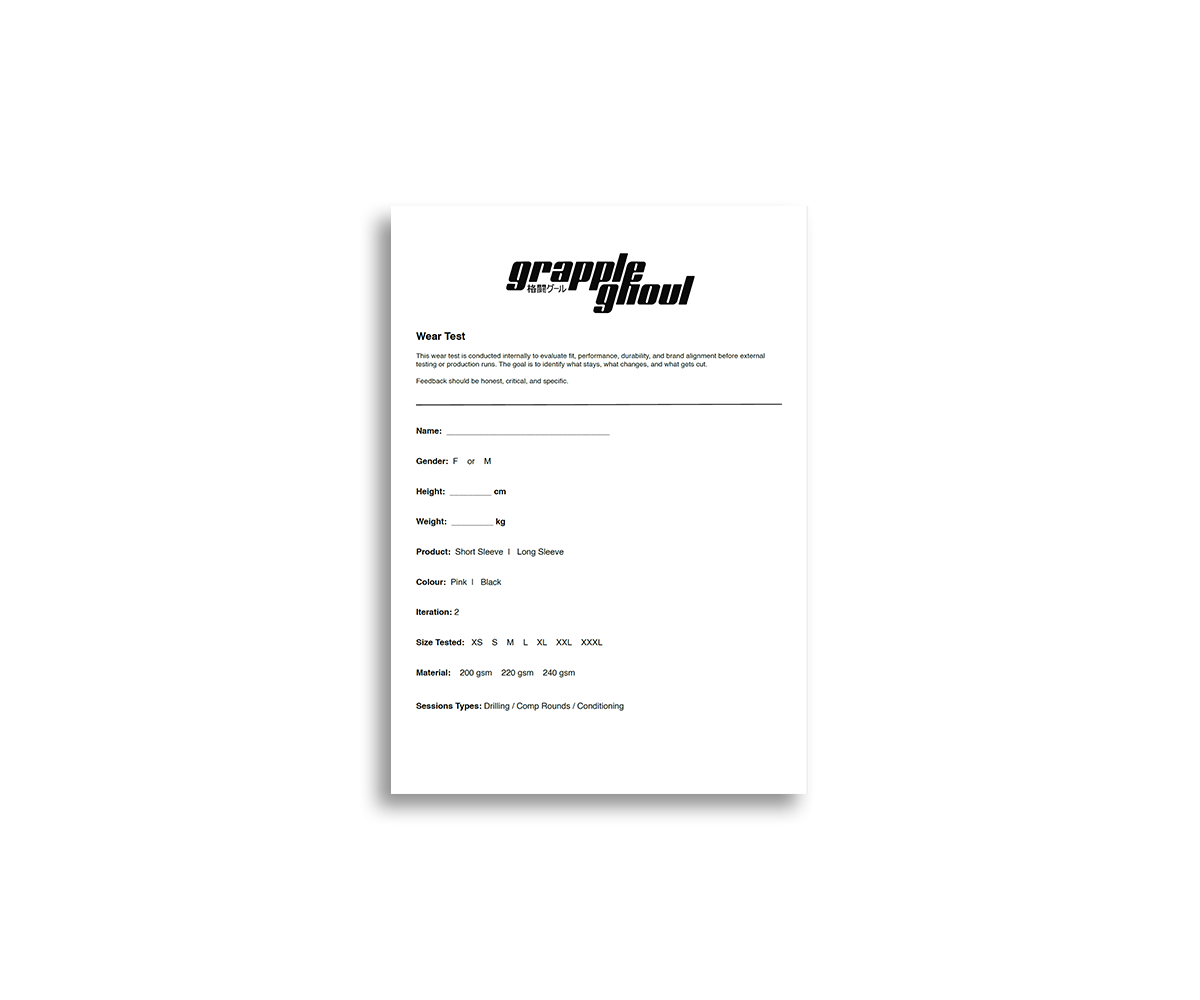
Designed through rapid prototyping and iteration
An initial technical design was developed and refined through three sample iterations with the manufacturer, focusing on:
- Panel placement for compression and mobility
- Sleeve and torso proportions
- Fabric tension and breathability balance
Setbacks during sampling directly informed construction and material adjustments.
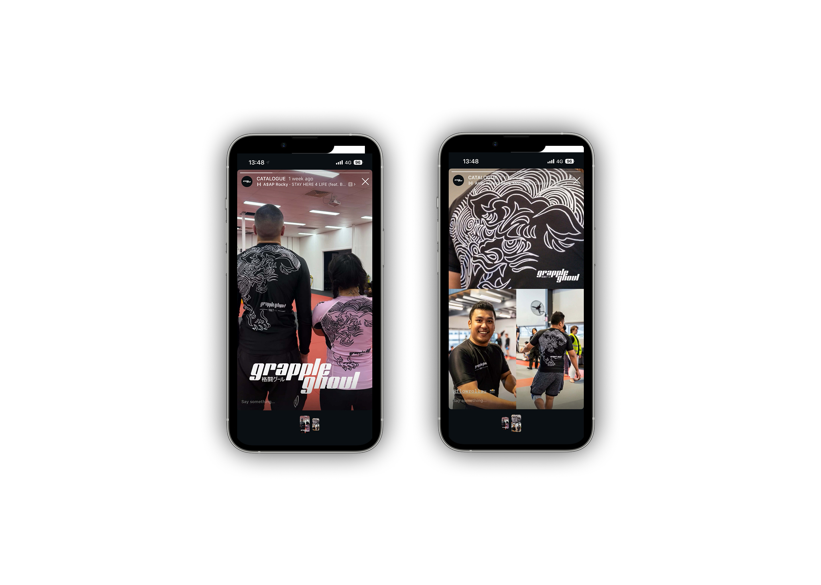
Prioritised community-led validation over paid reach
Instead of launching with marketing spend, I focused on organic engagement:
- Sharing progress on social platforms to gather early feedback
- Sponsoring two athletes to test the product in competition environments
- Using real-user input to guide refinement decisions
Balanced vision with manufacturability
Design decisions were continuously evaluated against production constraints to ensure the product remained functional, scalable, and feasible to produce.
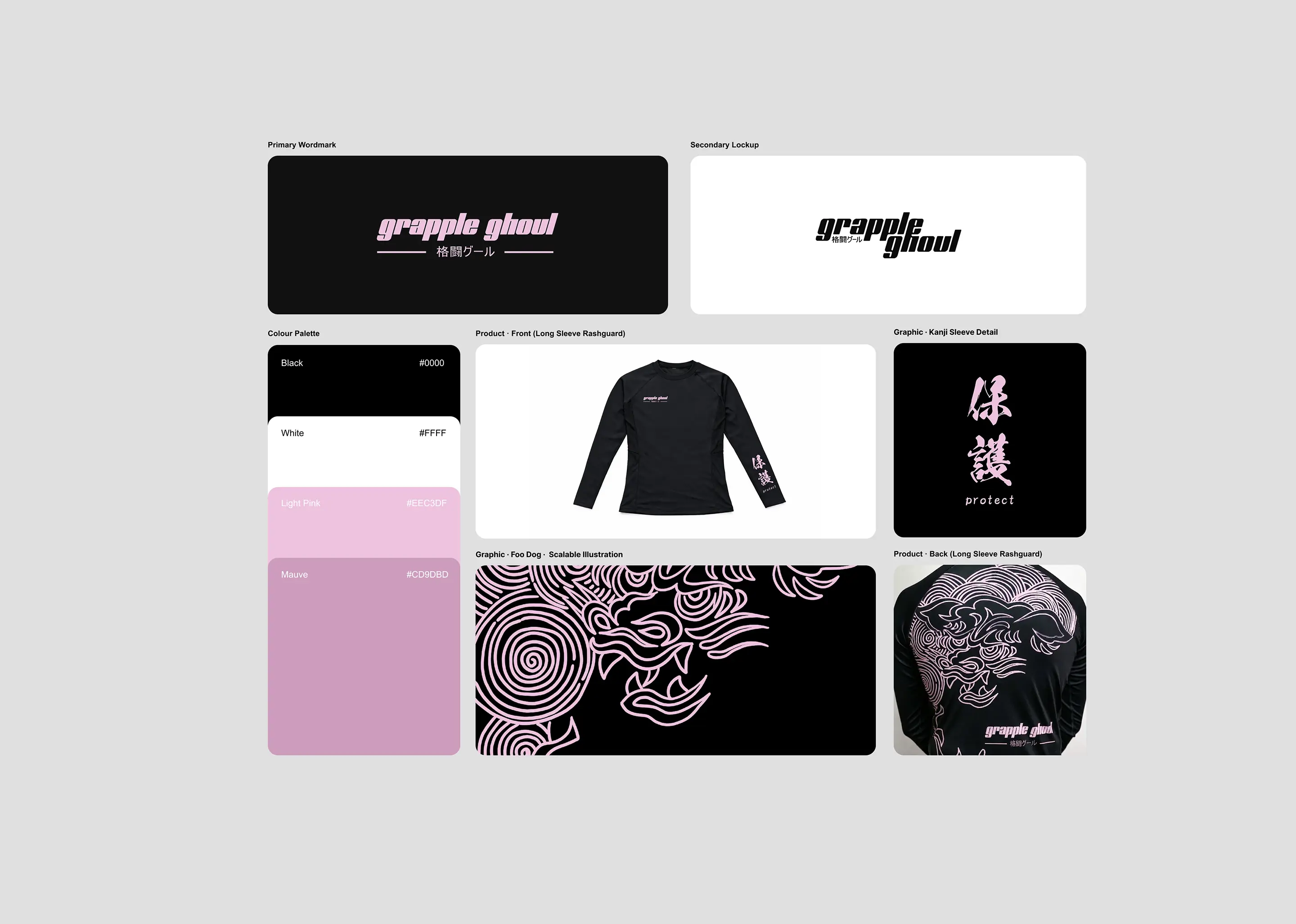
The System
Rather than designing a single garment, I developed a modular product and visual system to ensure consistency across fit, function, and brand expression.
1. Fit System
I defined proportional guidelines to better serve petite and Asian body types, addressing a gap in standard fightwear sizing.
- Adjusted sleeve-to-torso ratios for balanced compression
- Refined torso length to reduce bunching during movement
- Designed panel placement to support mobility and breathability
- Established repeatable fit logic for future product variations
This resulted in a base pattern system rather than one-off sizing solutions.
2. Construction System
The garment was structured using consistent performance-driven rules:
- Compression zones mapped to key muscle groups
- Breathable mesh side panels for ventilation
- Seam placements designed to reduce friction during grappling
- Material tension balanced between flexibility and durability
Each element followed functional logic rather than aesthetic preference.
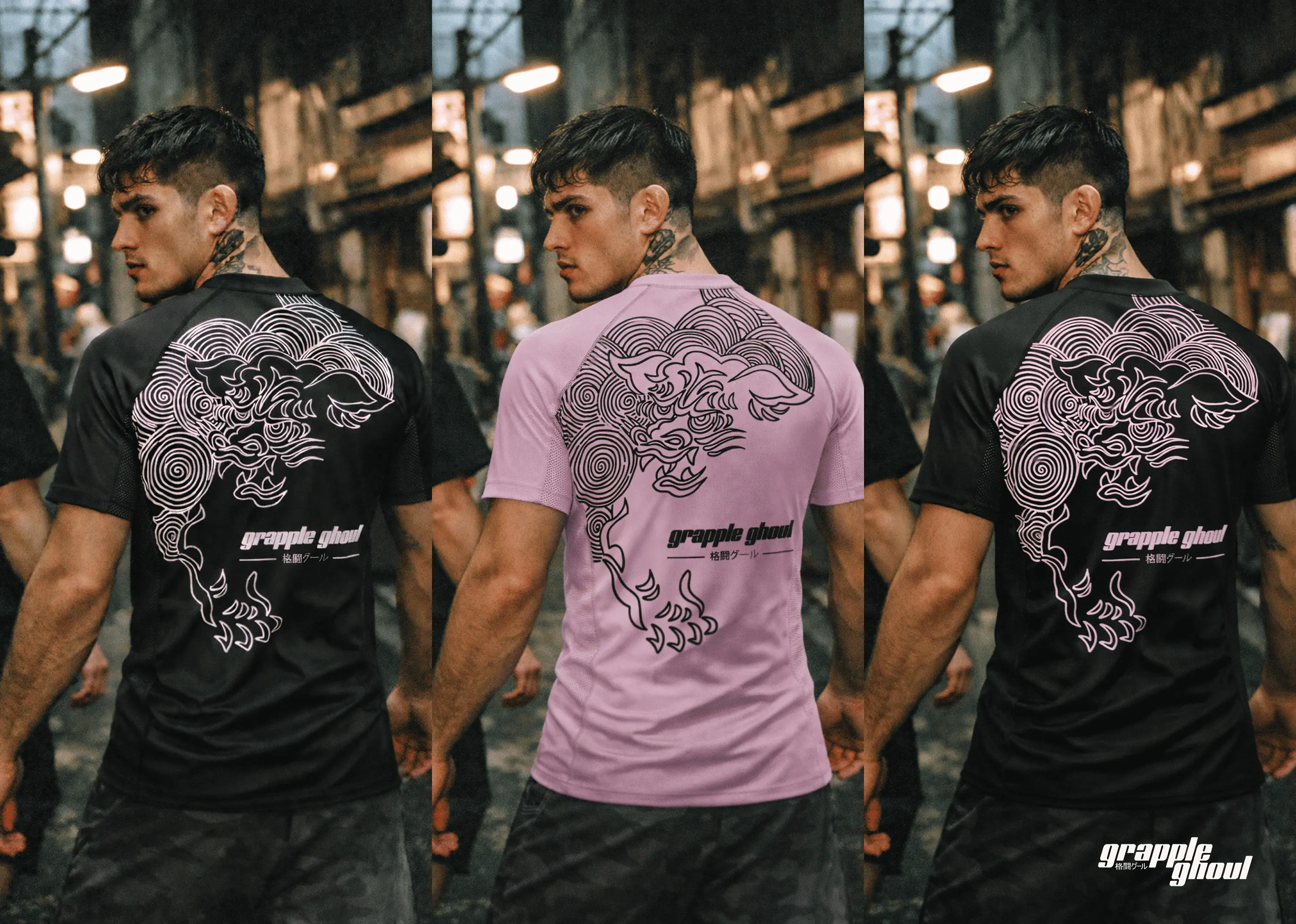
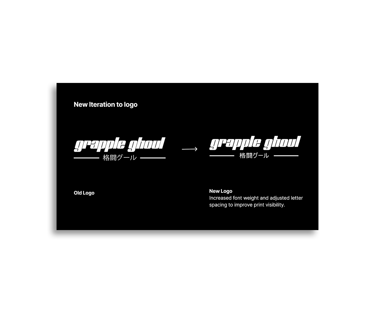
3. Visual Language System
To counter overly loud fightwear branding, I defined a restrained graphic framework:
- Minimal logo placement hierarchy (primary, secondary, or none)
- Limited colour palette per collection
- Graphic elements treated as structural accents rather than decoration
- Brand tone centred on cultural subtlety over aggression
This system allows the brand to scale visually without losing identity.
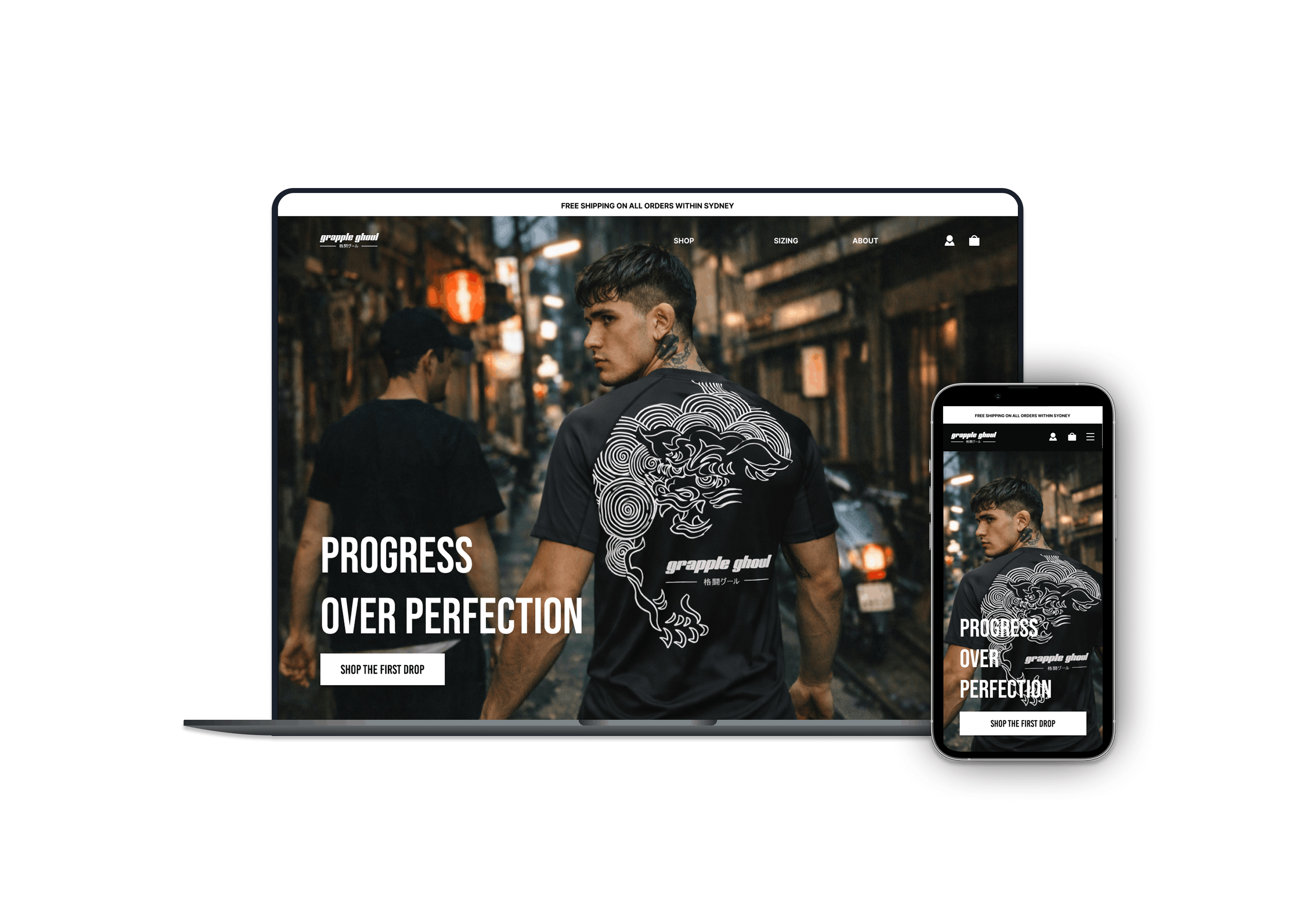
4. Product Experience System
Beyond the garment itself, I considered the broader purchase and usage experience:
- Clear sizing communication based on body proportions
- Community-led testing before scaling production
- Athlete validation used as an ongoing feedback loop
The goal was to reduce purchase risk and increase trust.
Outcome
The project evolved from an initial concept into a validated product and operational system during the early launch phase.
Product & Process Impact
- Iterative sampling improved garment accuracy across three versions, with each prototype moving closer to final production quality
- Technical packs became more detailed with each iteration, reducing ambiguity and improving manufacturer alignment
- Weekly work-in-progress reviews established structured decision-making and prioritisation workflows
Communication & Production Efficiency
- Manufacturer communication improved over time, enabling clearer translation of design intent into physical output
- Feedback loops between design, sampling, and revision became more streamlined
Market Validation
- Secured 60 pre-orders during a soft launch without paid advertising
Early Audience Signal
- Post reach increased from 2,123 → 2,830 views
- Direct shares via DM increased 3.5× (6 → 21)
- Comment activity increased, indicating deeper engagement
- Gained 144 followers through word-of-mouth, signalling community-led interest
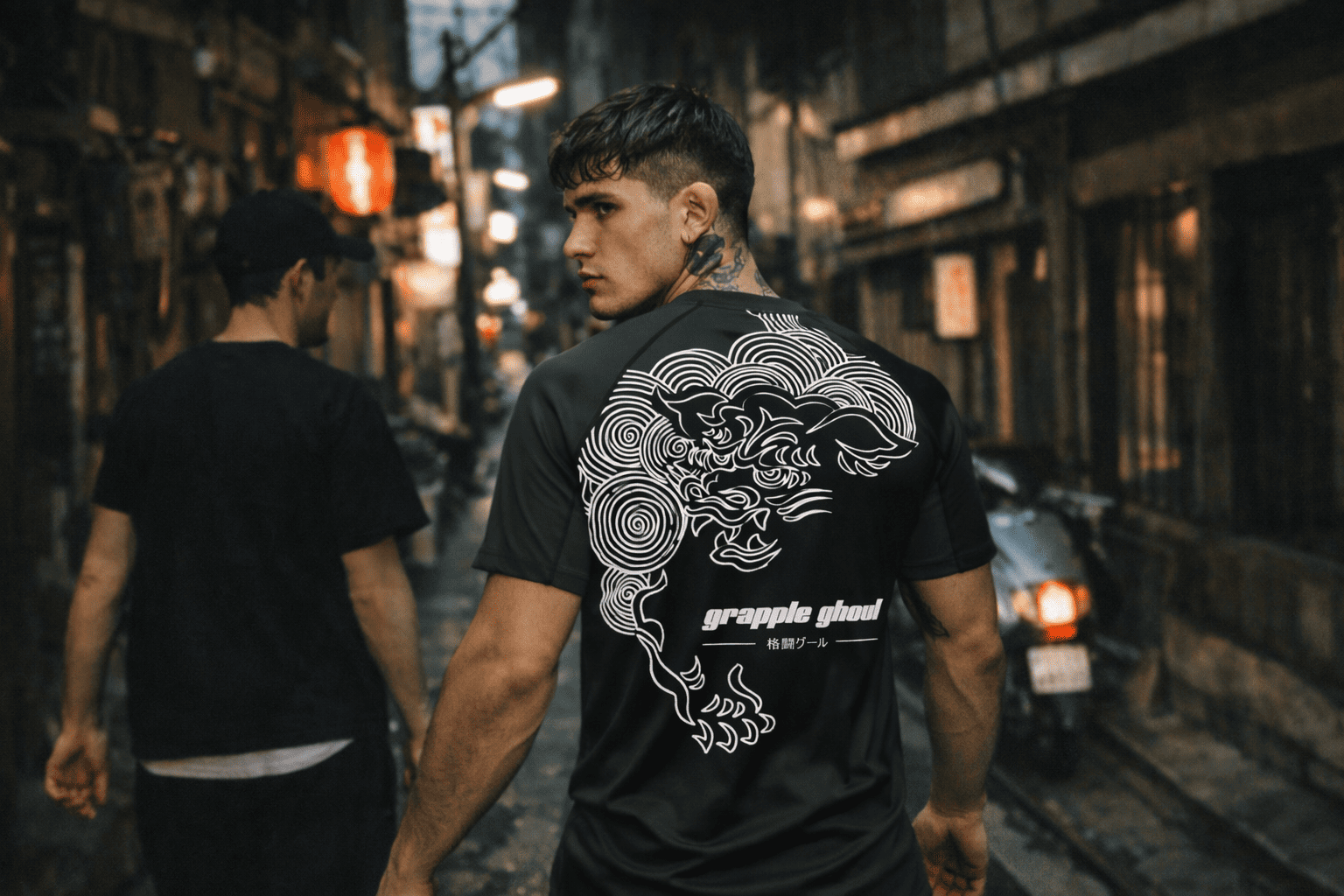
Real-World Testing
- Sponsored two local athletes to test the product in competition environments, using performance feedback to inform refinements
Portfolio Showcase